
Restoration Beef | Branding
Brand Identity • Design System • Photography
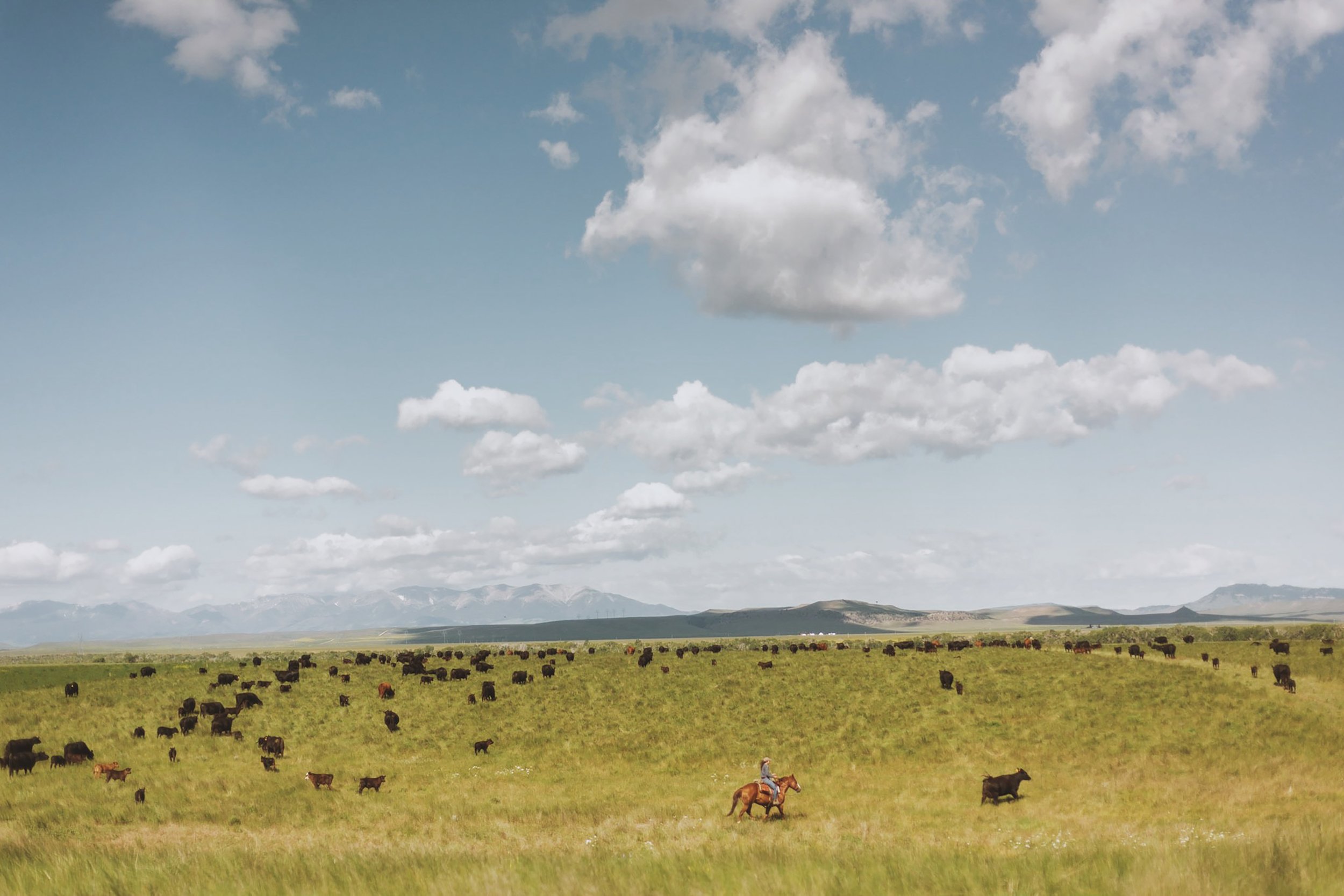
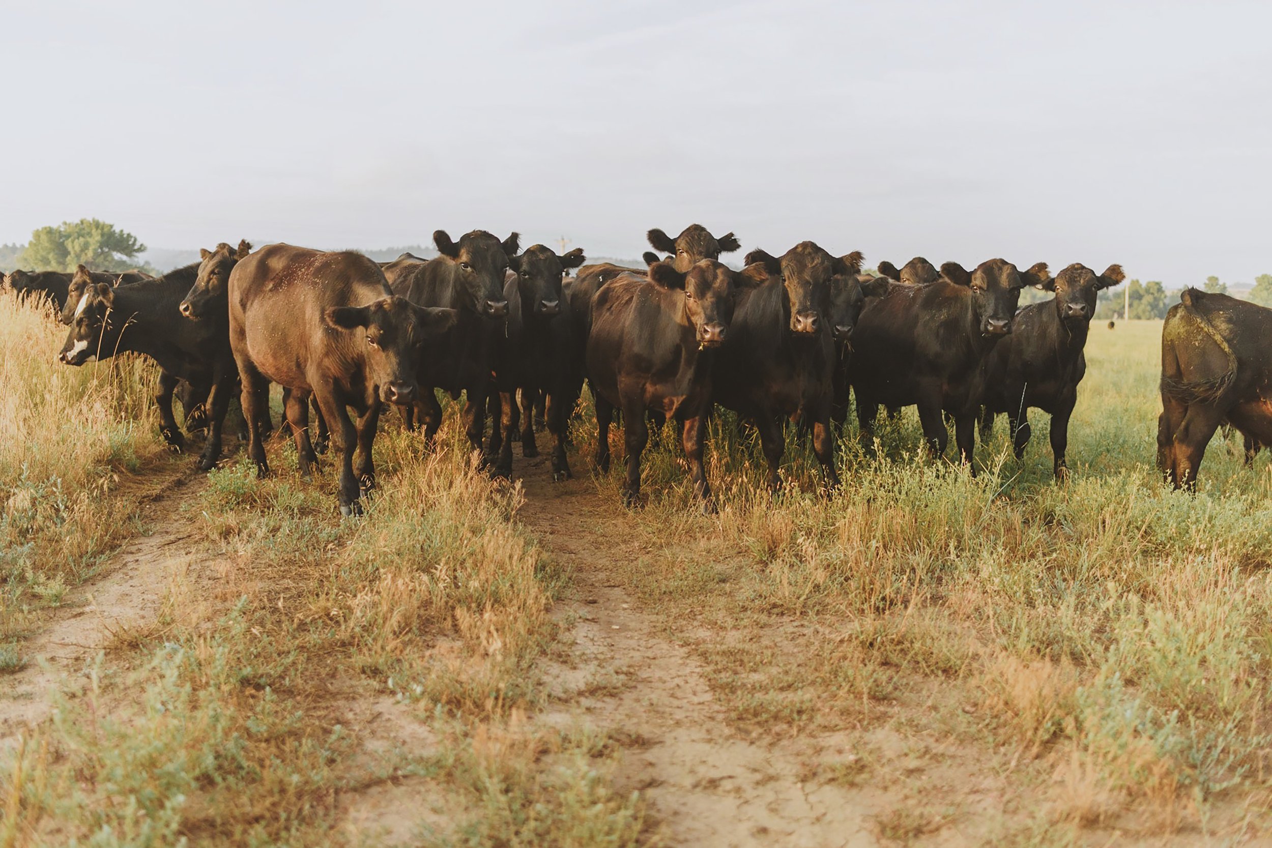
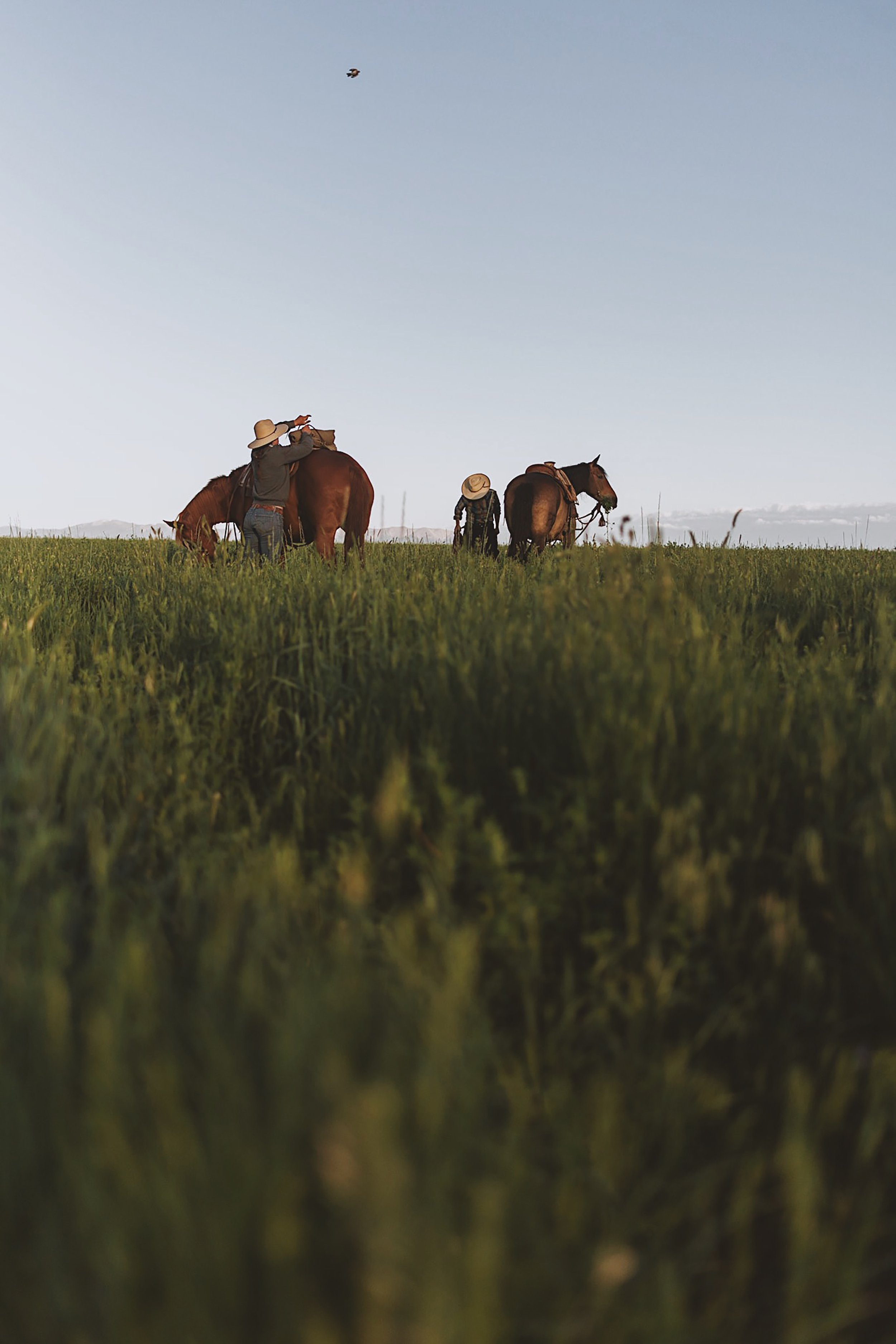
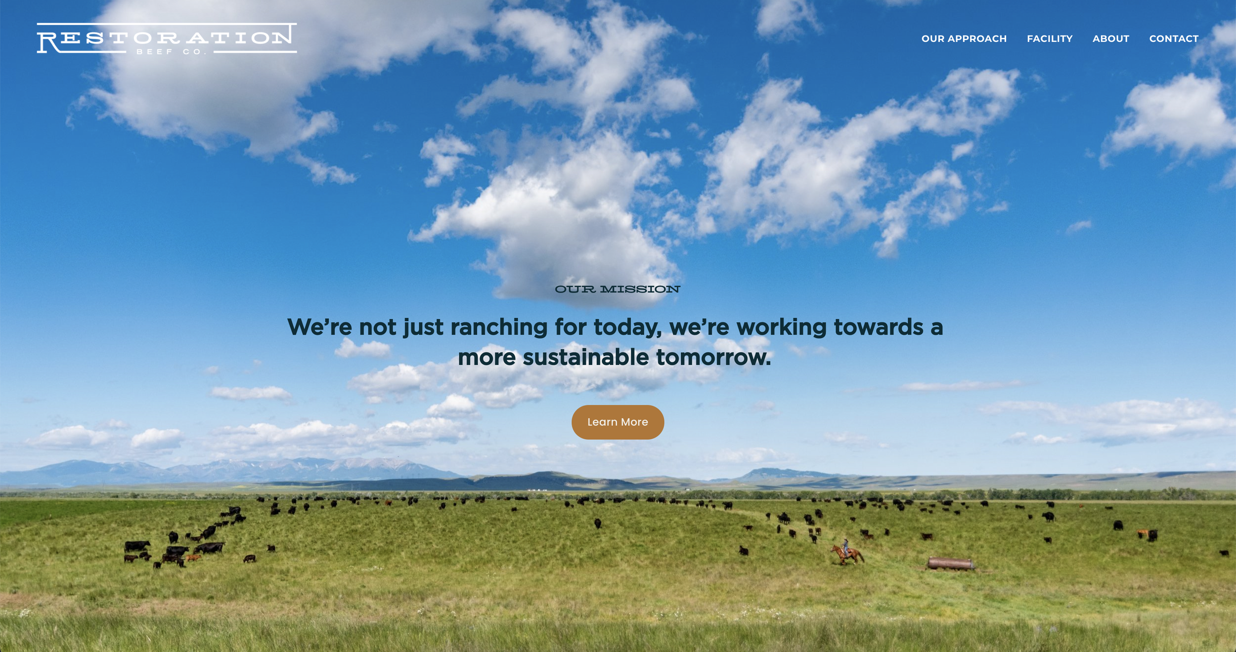
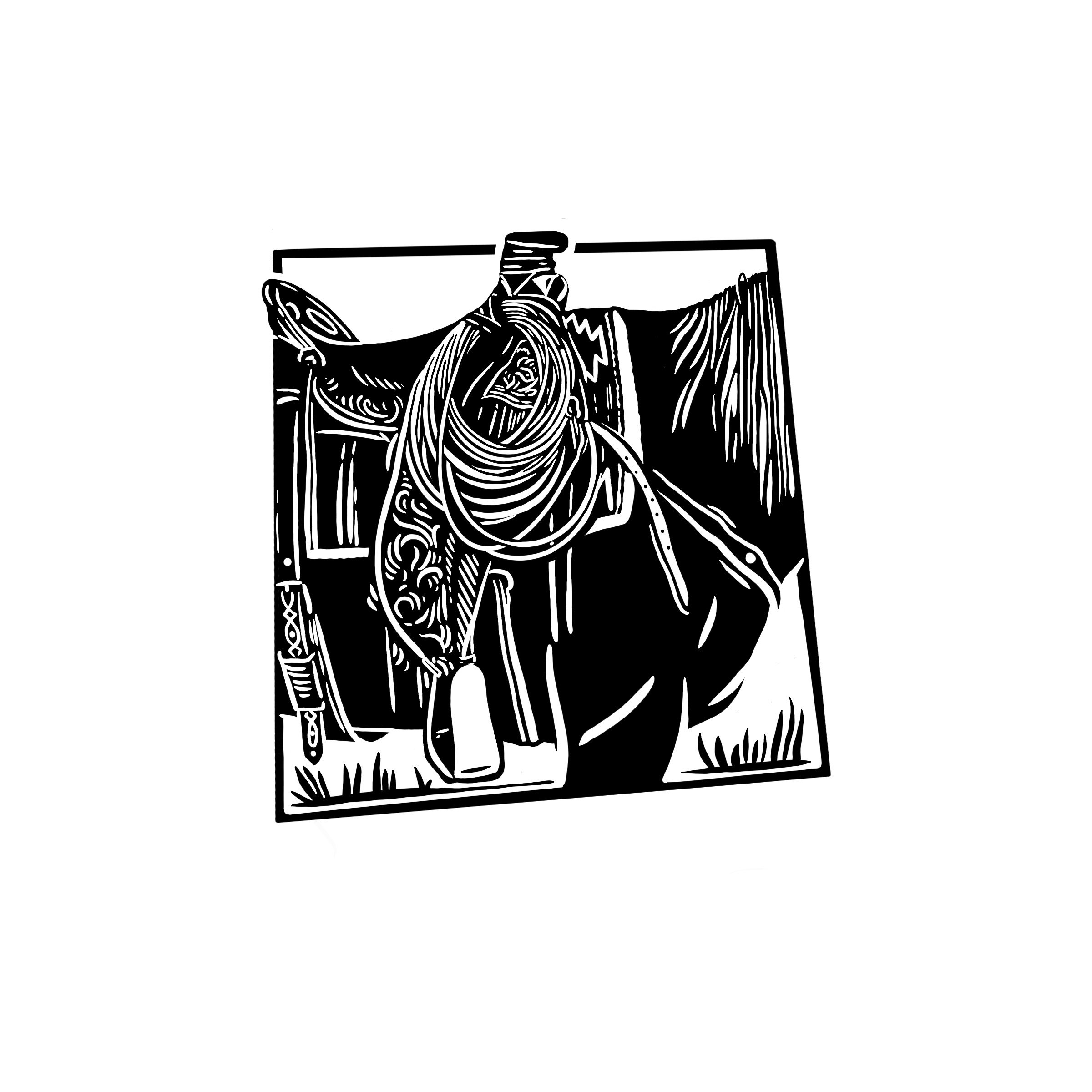
While working as Art Director at Seacat Creative, I led the full brand and digital development for Restoration Beef Co., a Montana-based startup focused on regenerative cattle ranching. The project included shaping the brand’s core messaging and narrative strategy, designing and launching a responsive website, and creating distinct pitch decks tailored for investors, ranchers, and suppliers. I collaborated with designer Erik Dale to help develop the visual identity system—including logos, type, color, and brand standards—and also directed an on-site photoshoot to build an authentic, evergreen image library. From copywriting and UX to final design implementation, this project reflects a holistic, values-driven approach to storytelling and visual communication in the agricultural space.


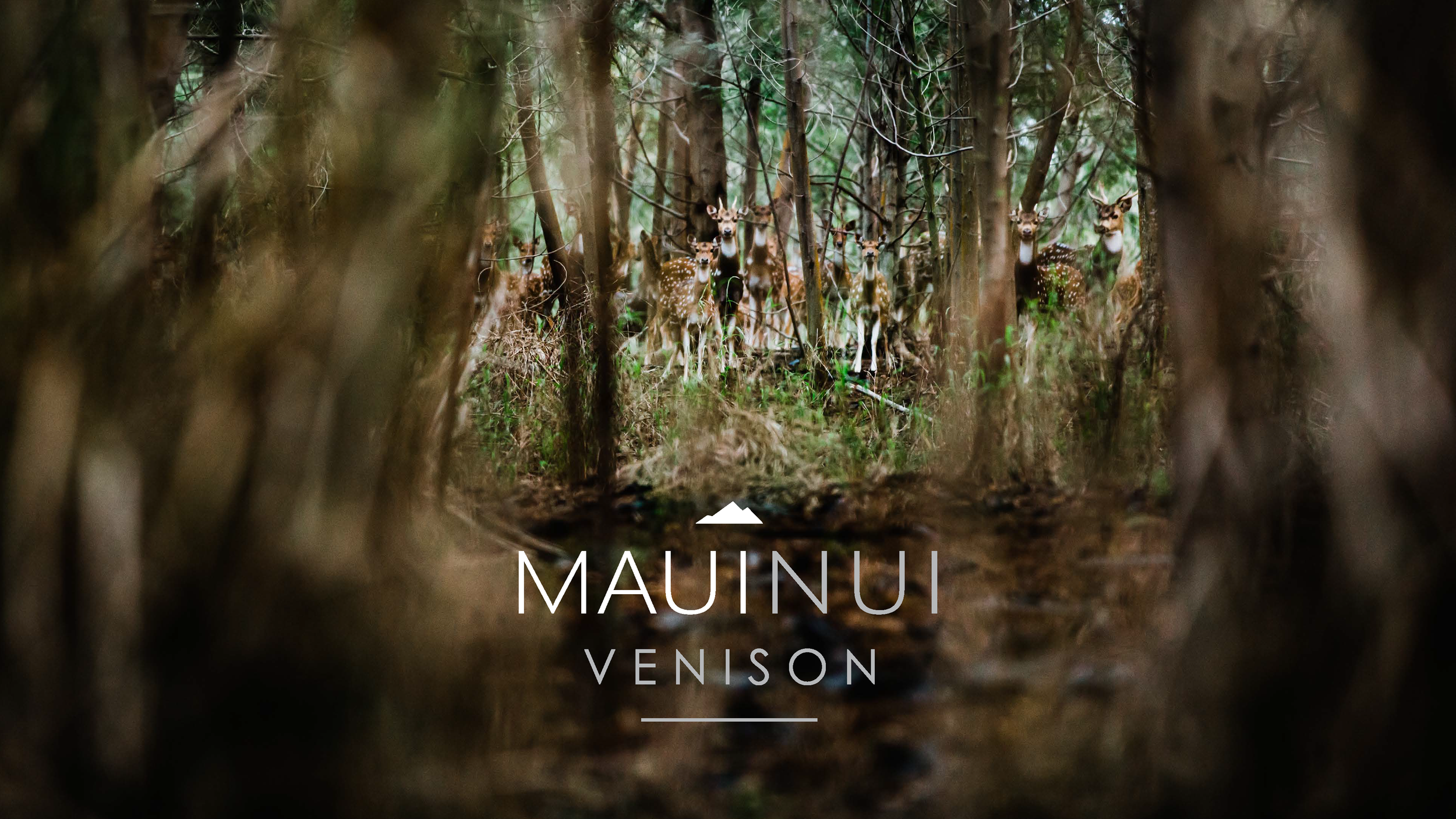
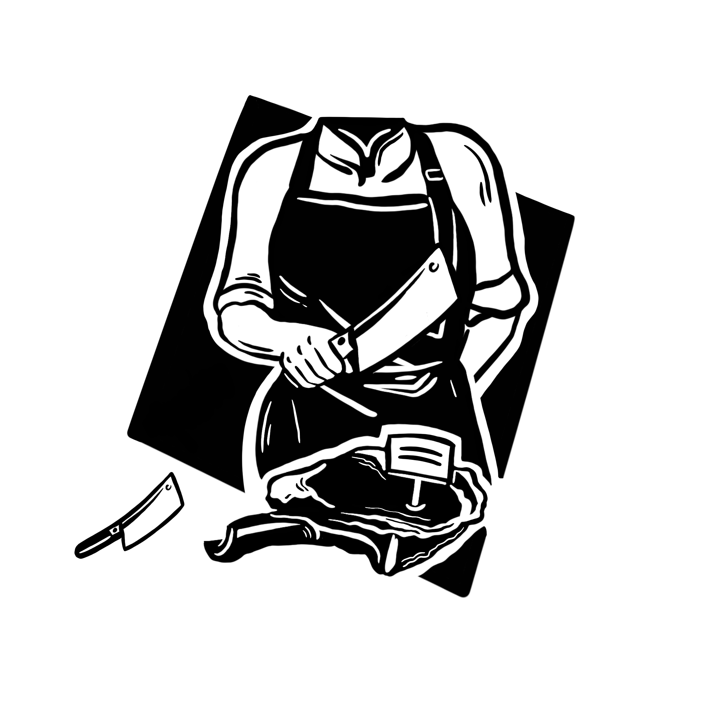
Maui Nui Venison | Patagonia Provisions
Brand Strategy • Campaign Design • Brand Maintenance • Packaging
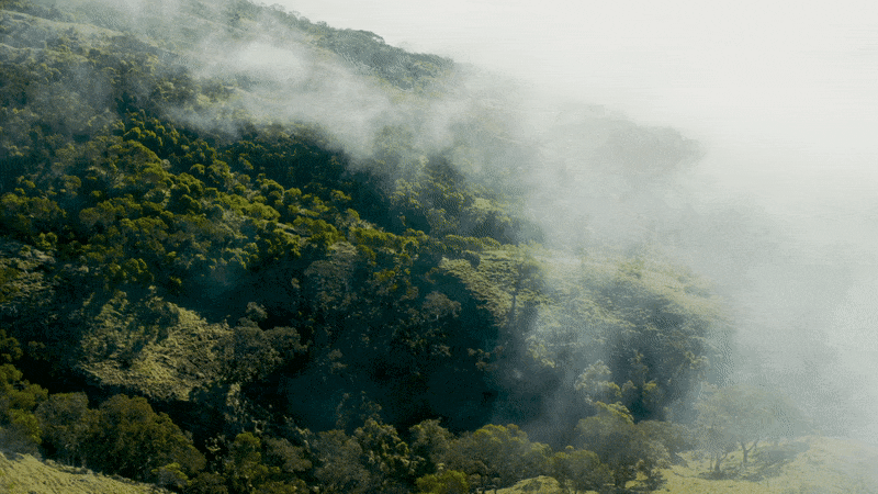
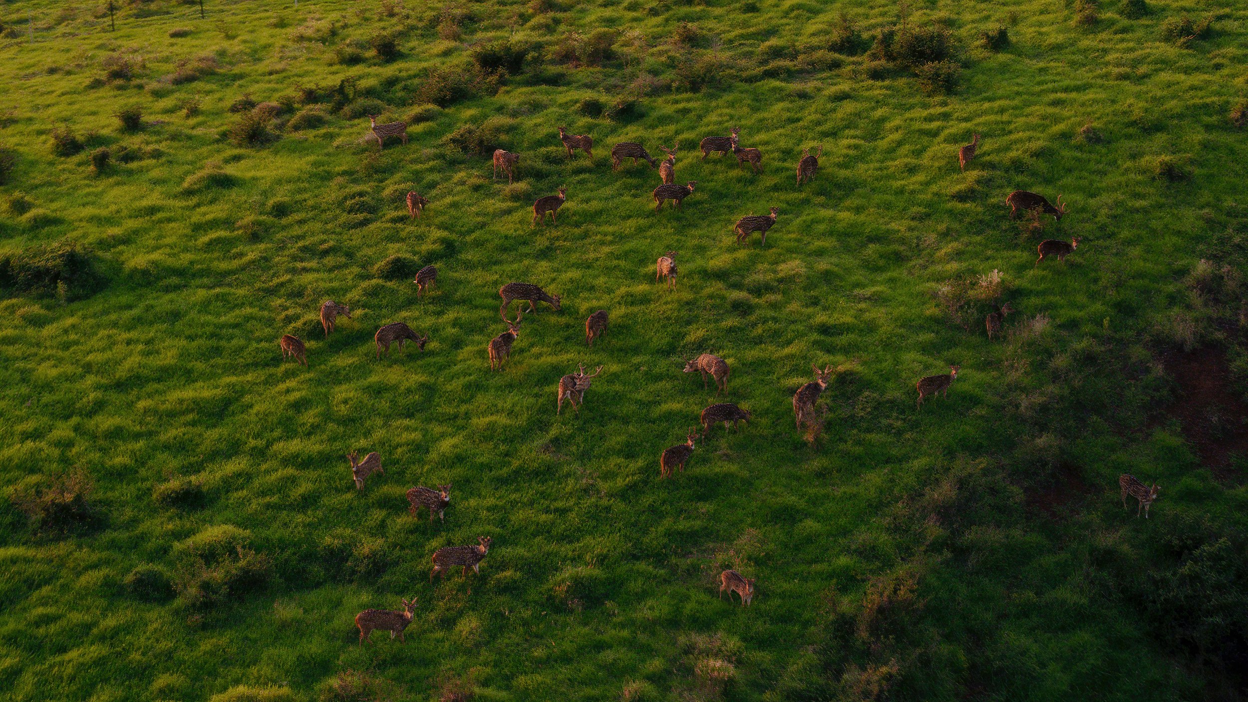
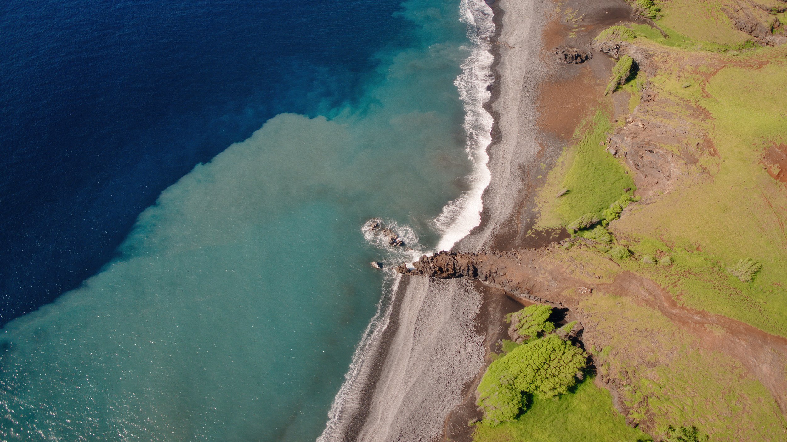
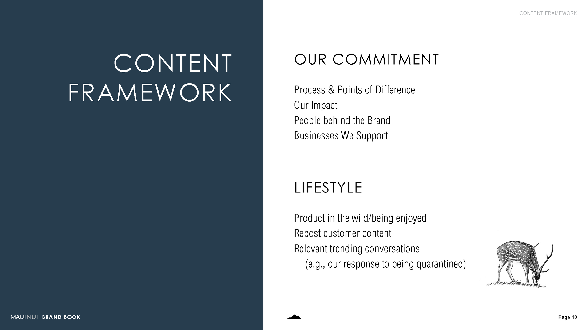
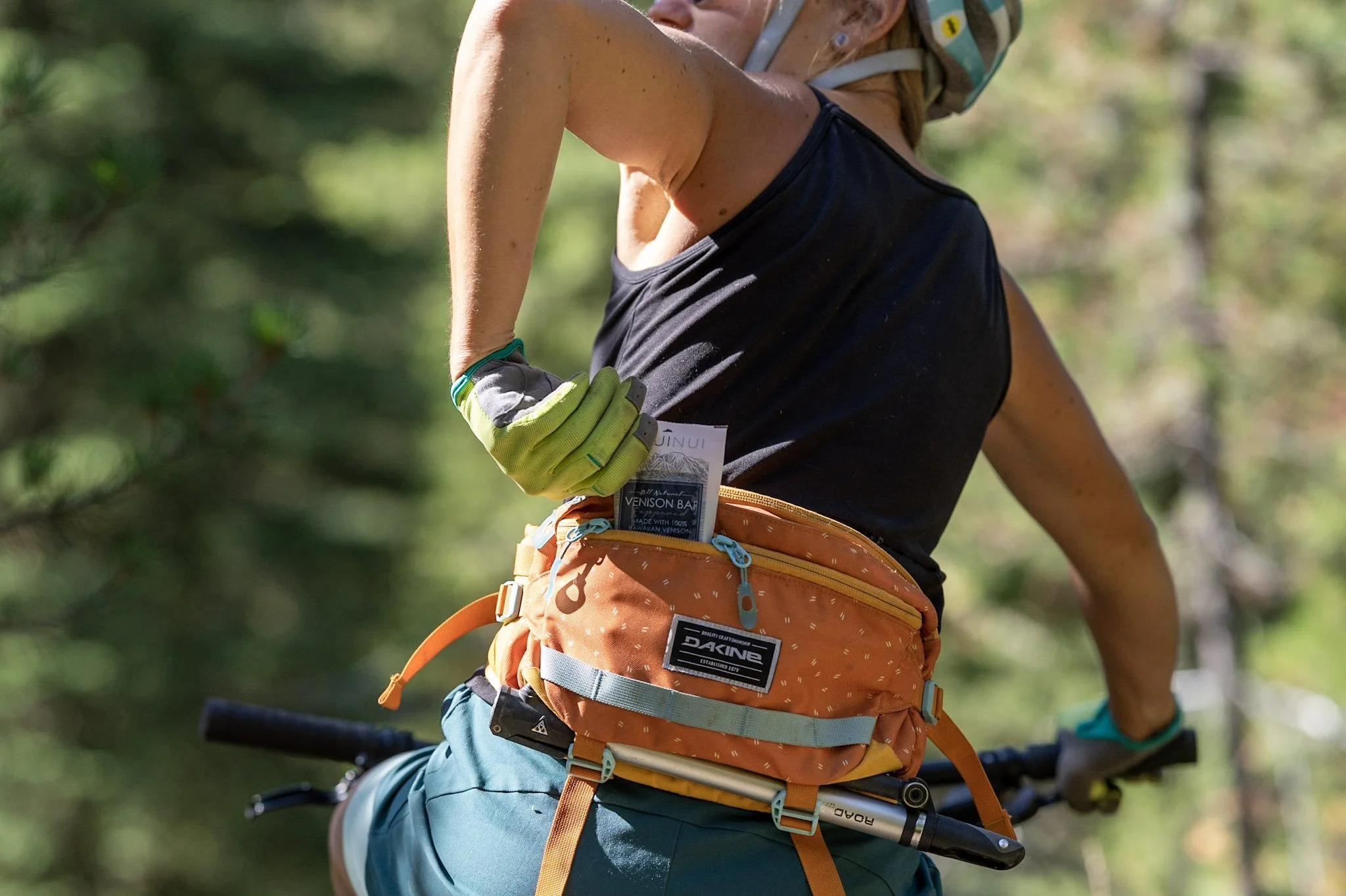
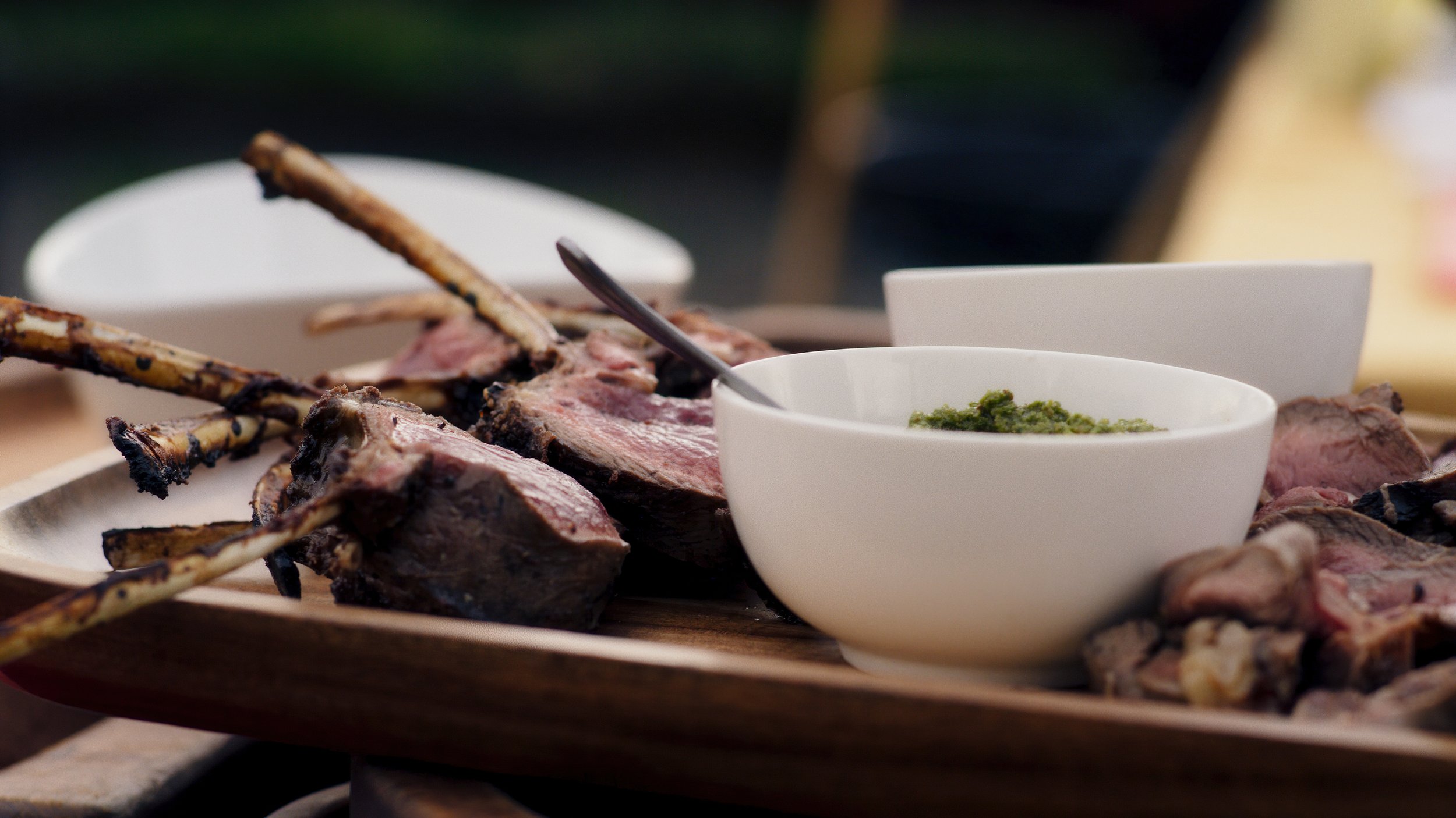
As Art Director at Seacat Creative, myself and the Seacat team led creative direction for Maui Nui Venison during a pivotal stage of growth. At the time, Maui Nui was four years into their journey, and we were brought in to deepen their storytelling, expand digital reach, and align their brand experience across platforms. This project aimed to not only increase sales but also support Maui Nui’s mission to reframe the food system through thoughtful land management and responsible harvesting practices.
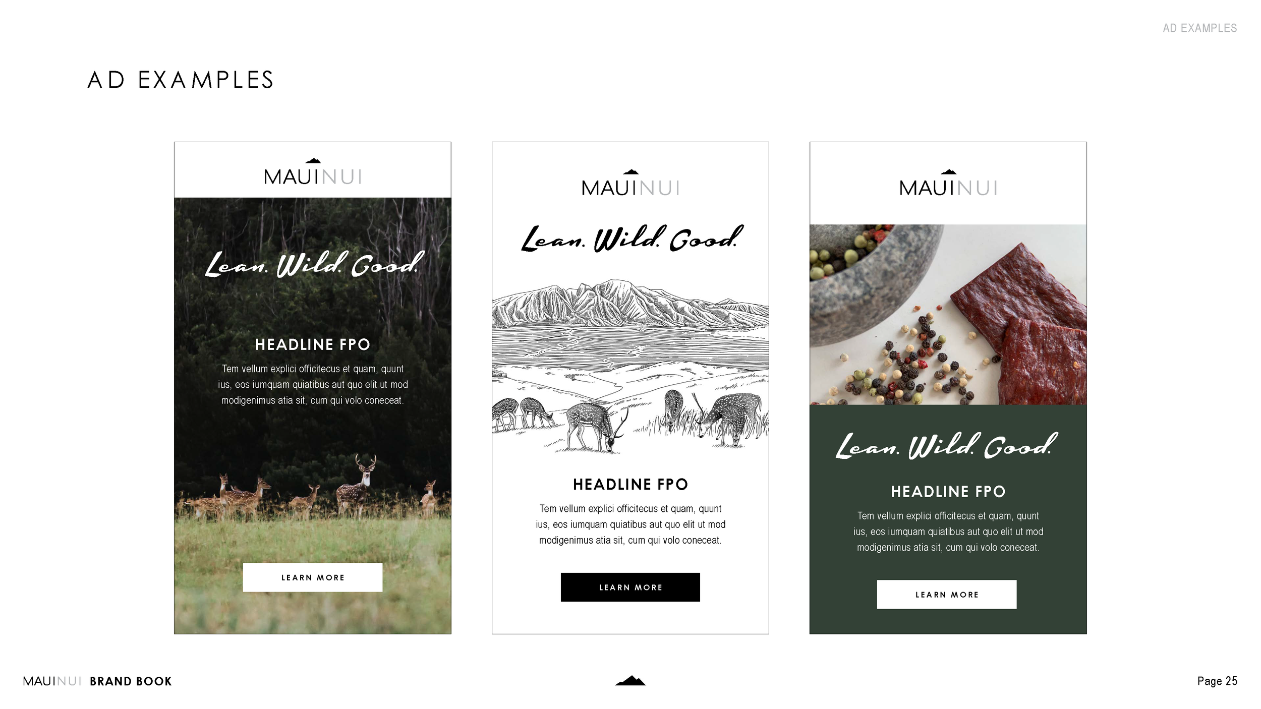
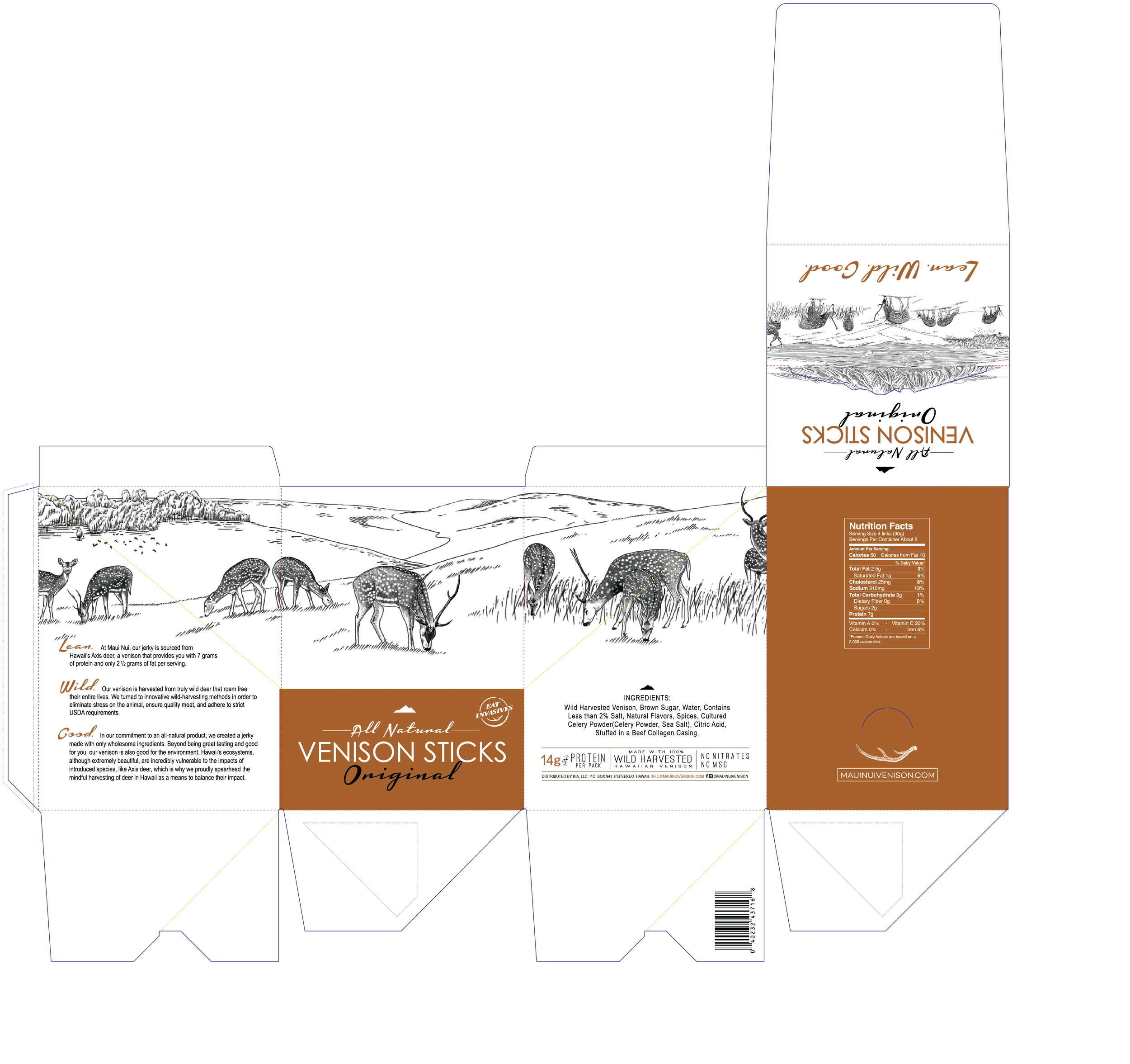
Our scope included developing brand messaging, managing content systems for social and email, and designing consistent visual assets across digital and print channels. We worked closely with the Maui Nui team to guide everything from social media strategy and copy to long-form content and digital ad campaigns and packaging design.
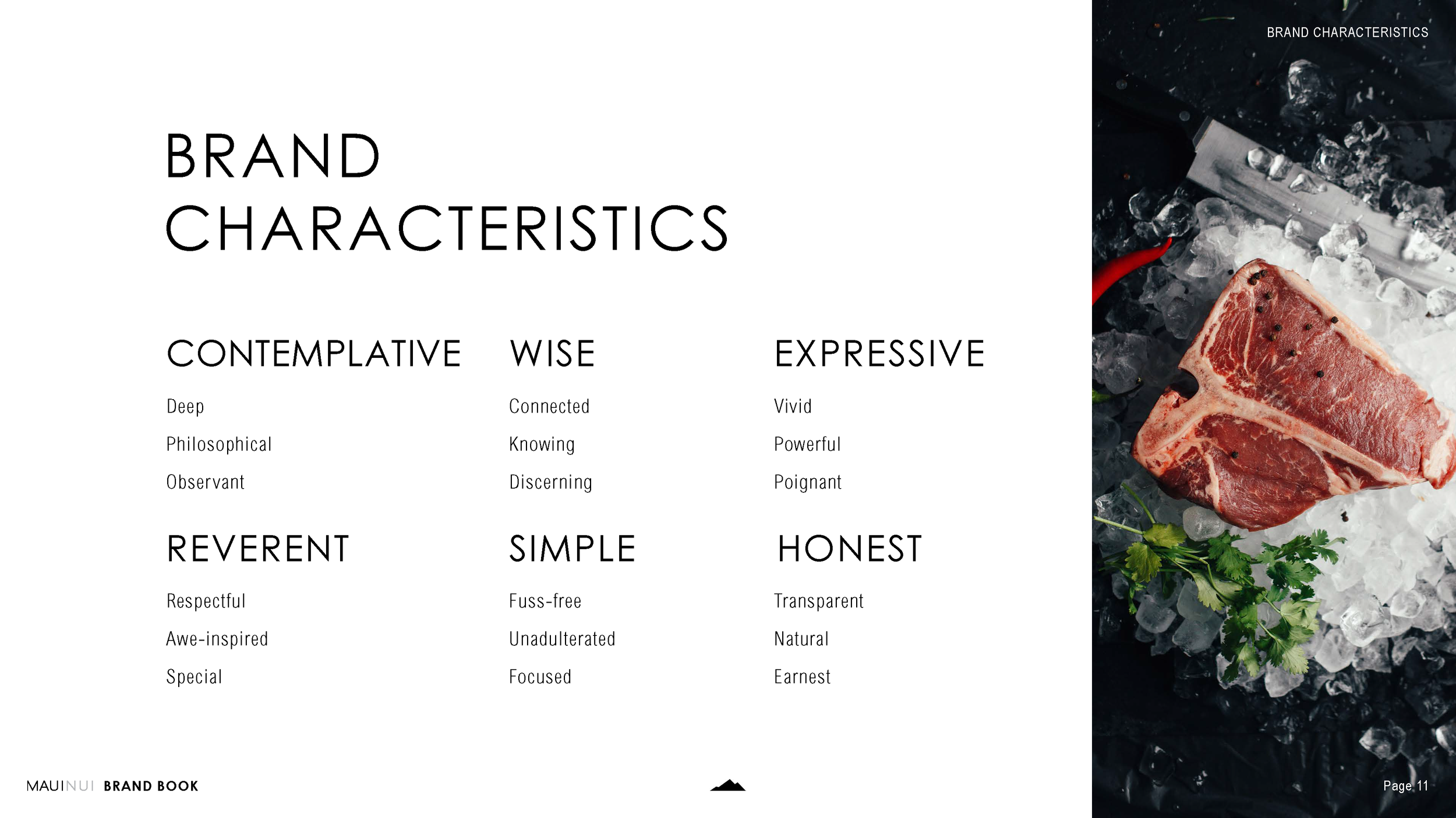
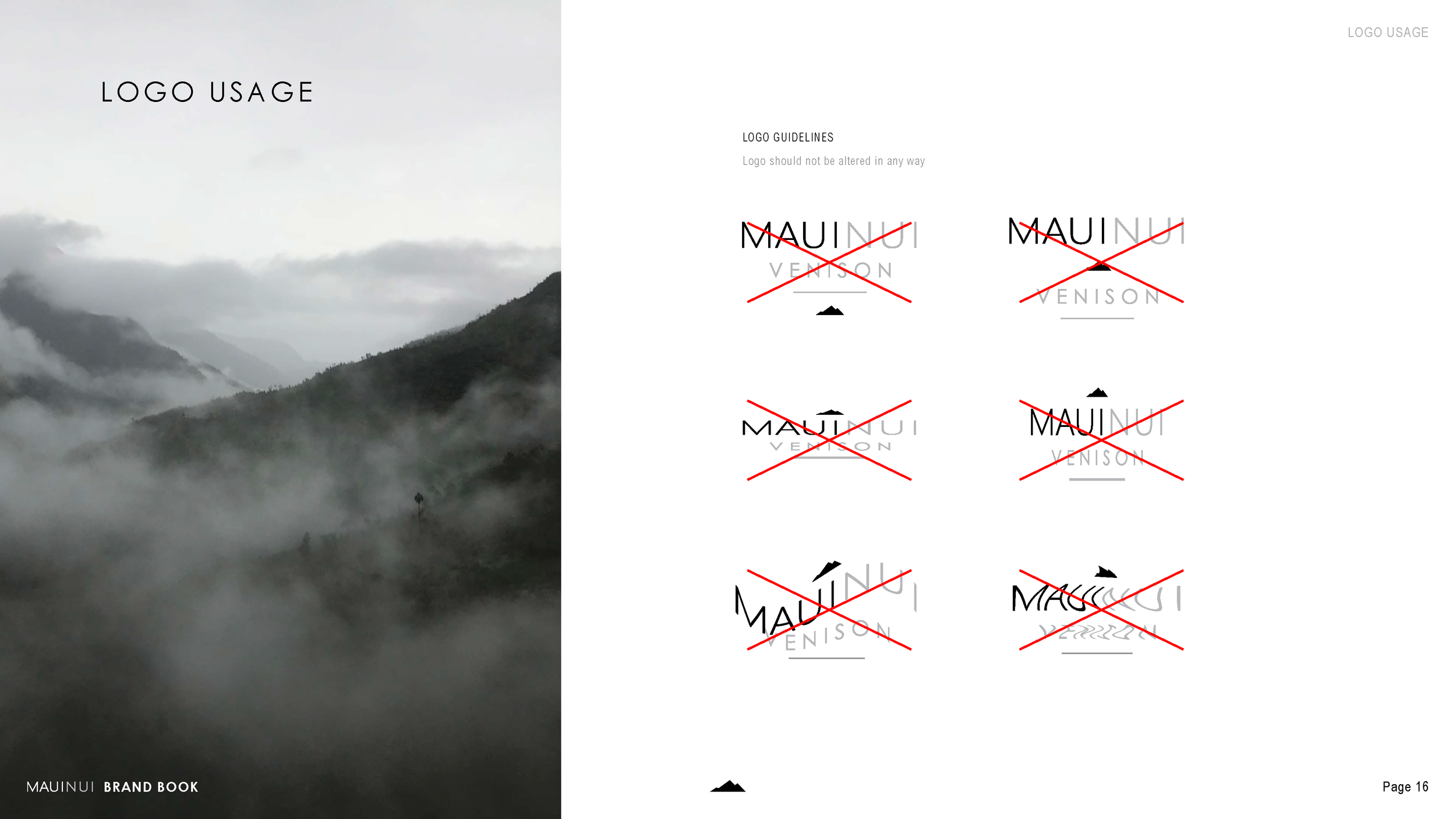
We also supported larger storytelling efforts—producing a short film in collaboration with Patagonia Provisions, establishing a formal brand ambassador program, and multiple internal brand guides. These elements helped unify the brand's visual language and extended its reach through both community and retail channels.
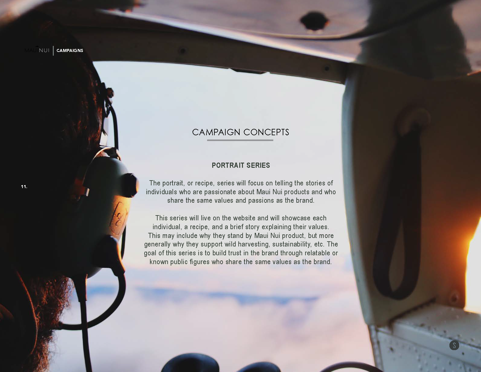
Our creative team traveled regularly to Hawai‘i to collaborate in person, build trust, and create authentic content that reflected the values and realities of the work on the ground. The result was a rich brand system grounded in narrative clarity, strong aesthetics, and regenerative principles—something I was proud to be a part of and help lead.


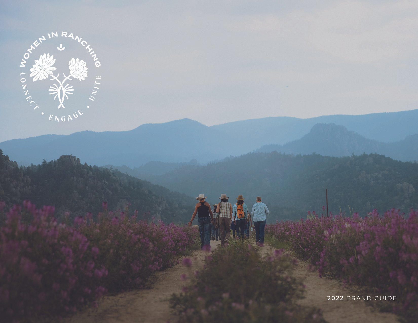
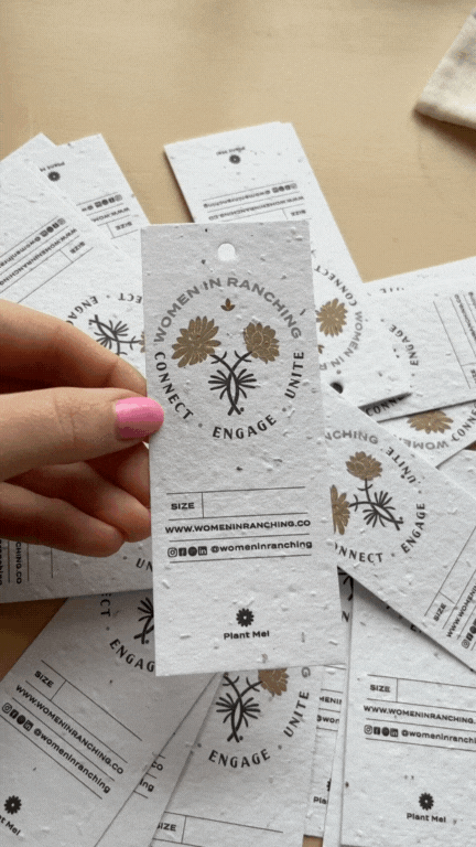
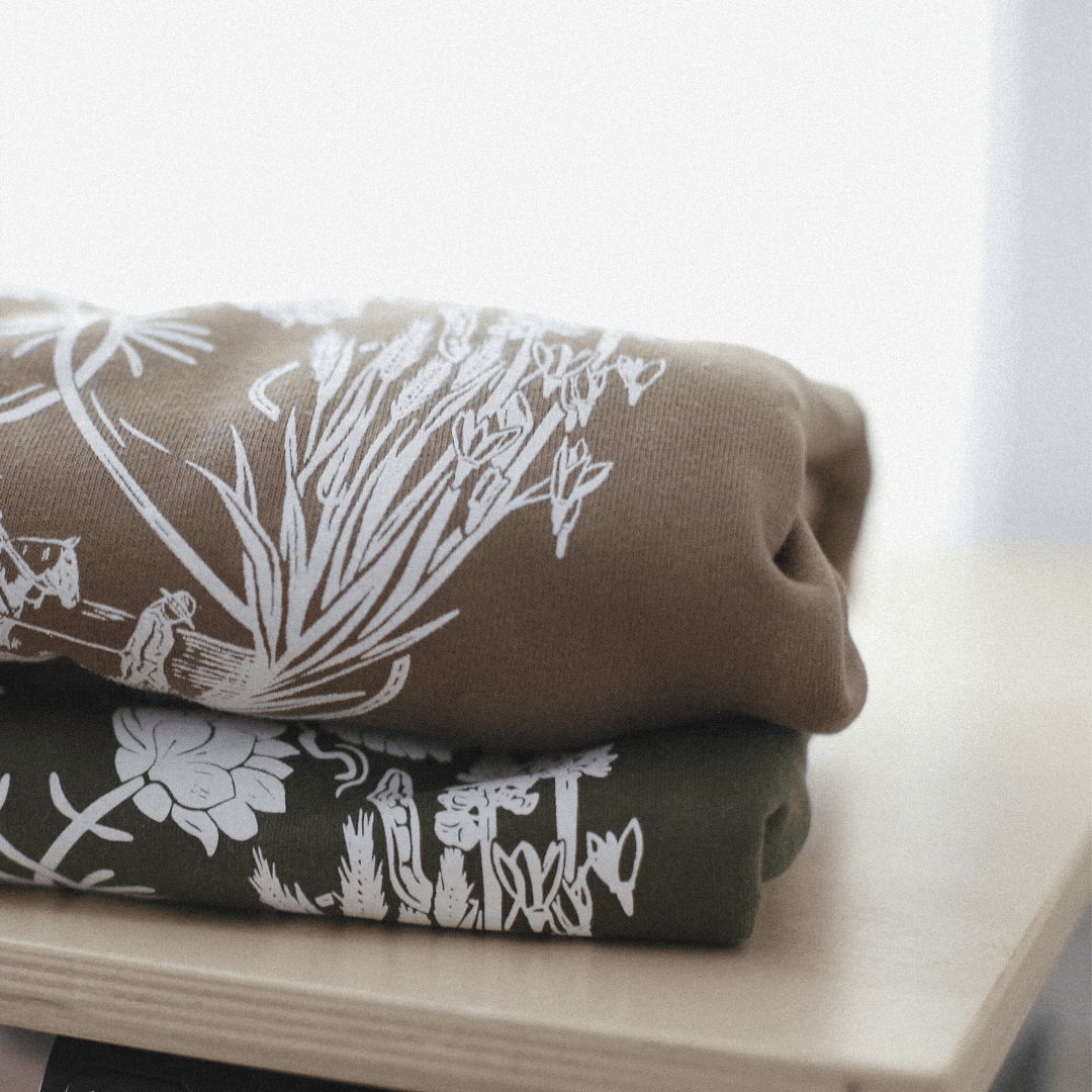
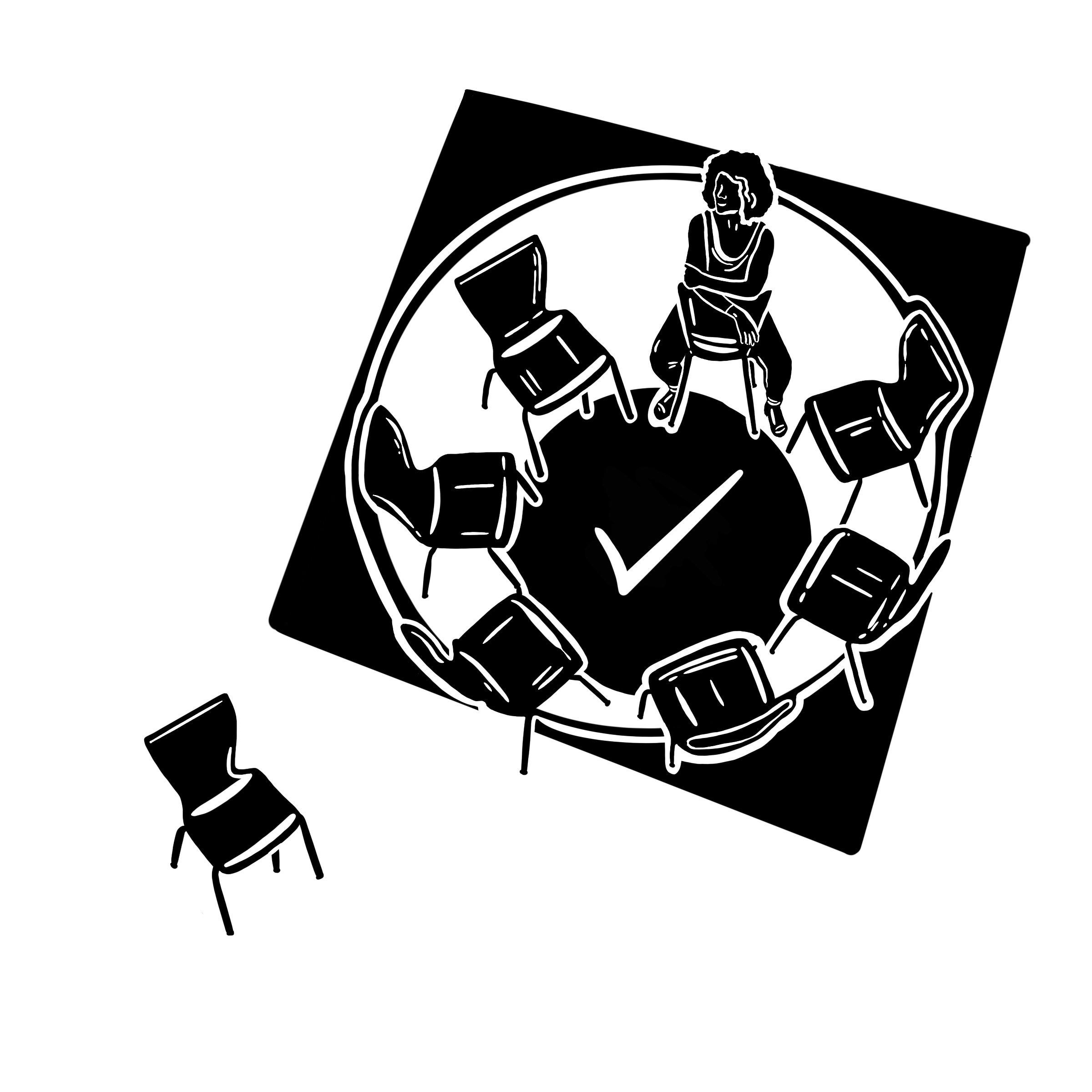
Women In Ranching | Identity Rollout
Brand Identity • Design System • Photography
Women in Ranching is a national nonprofit network that connects, supports, and elevates women in land stewardship, ranching, and agriculture. Originally founded as a program within the Western Landowners Alliance, the organization transitioned into an independent nonprofit in 2022—a pivotal moment that required a full identity launch, legal formation, and brand foundation from the ground up.
I joined as Communications + Creative Director to help lead this transition. Working closely with the Executive Director, I supported the establishment of nonprofit status, guided the trademark process, and helped shape the organization’s overall strategic vision and foundation. I developed a new visual identity, launched a website, and built out a communications system that honored the community’s values while preparing the organization for long-term growth.
Since launch, I’ve remained on as a Communications Director contractor, overseeing high-level brand strategy and day-to-day communications. My role spans content direction, website design and maintenance, CRM development, contractor coordination, social marketing, production sourcing, and the creation of digital and print collateral for events, fundraising, and programming.
This project reflects a deep commitment to collaborative, mission-driven design—helping build a movement from within and ensuring its voice, visuals, and systems evolve with integrity.


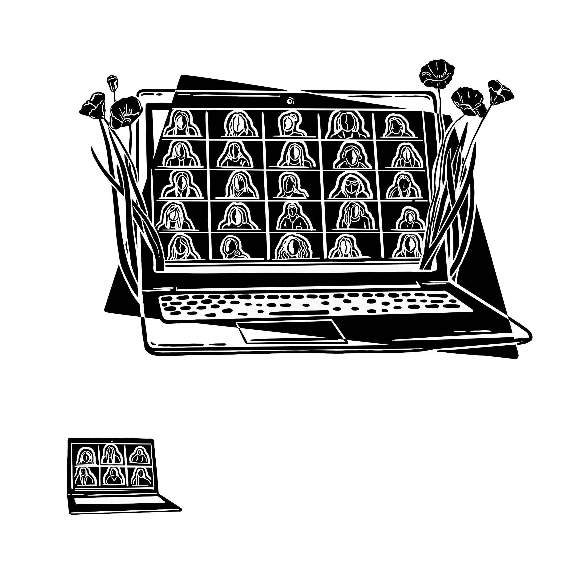
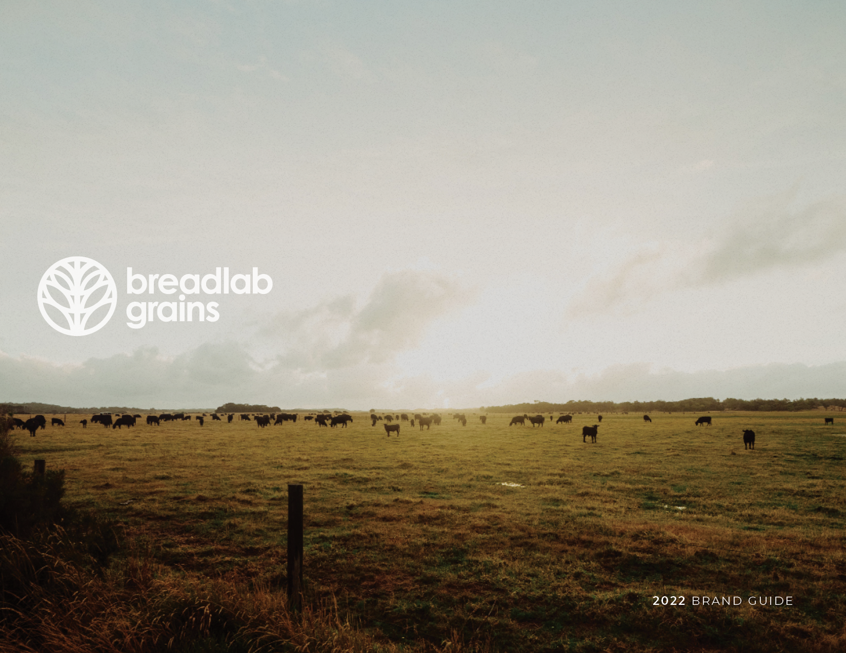
Breadlab Grains | Branding
Brand Identity • Design System • Photography
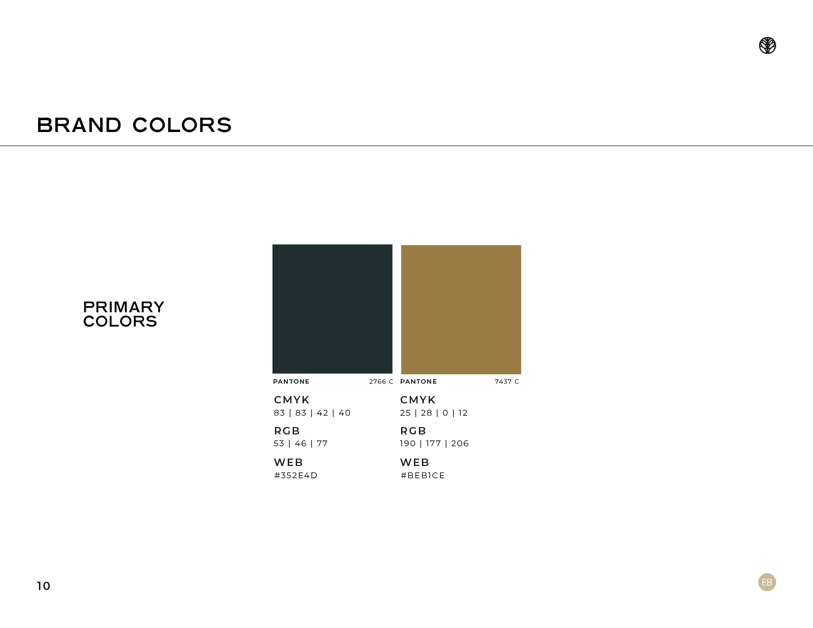
I led the brand development of Breadlab Grains, a regenerative grain initiative created in partnership with The Bread Lab at Washington State University—a renowned research institution focused on breeding regionally adapted grains for improved nutrition, climate resilience, and flavor. Breadlab Grains was established as the operational brand to support the distribution of these grain varieties to institutional partners including The Land Institute, Patagonia Provisions, Panera Bread, and King Arthur Baking. While not consumer-facing, the identity needed to convey scientific credibility and regenerative values—while maintaining the flexibility to evolve into a product-facing brand should The Bread Lab choose to market its own flours or finished goods.
I created a full visual identity system—logo, color, type, and brand standards—alongside a foundational narrative framework for the website and marketing strategy. We developed targeted messaging for diverse stakeholders including research institutions, regenerative certification bodies like RegenVerify™, and supply chain collaborators. Deliverables also included web content architecture, creative direction for field and product photography, and branded collateral for launch and partner engagement.
This project exemplifies how thoughtful design can support systemic change—establishing a visual and narrative foundation for a brand working to shift how grain is grown, valued, and shared across a regenerative food system.


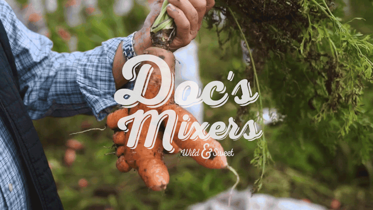
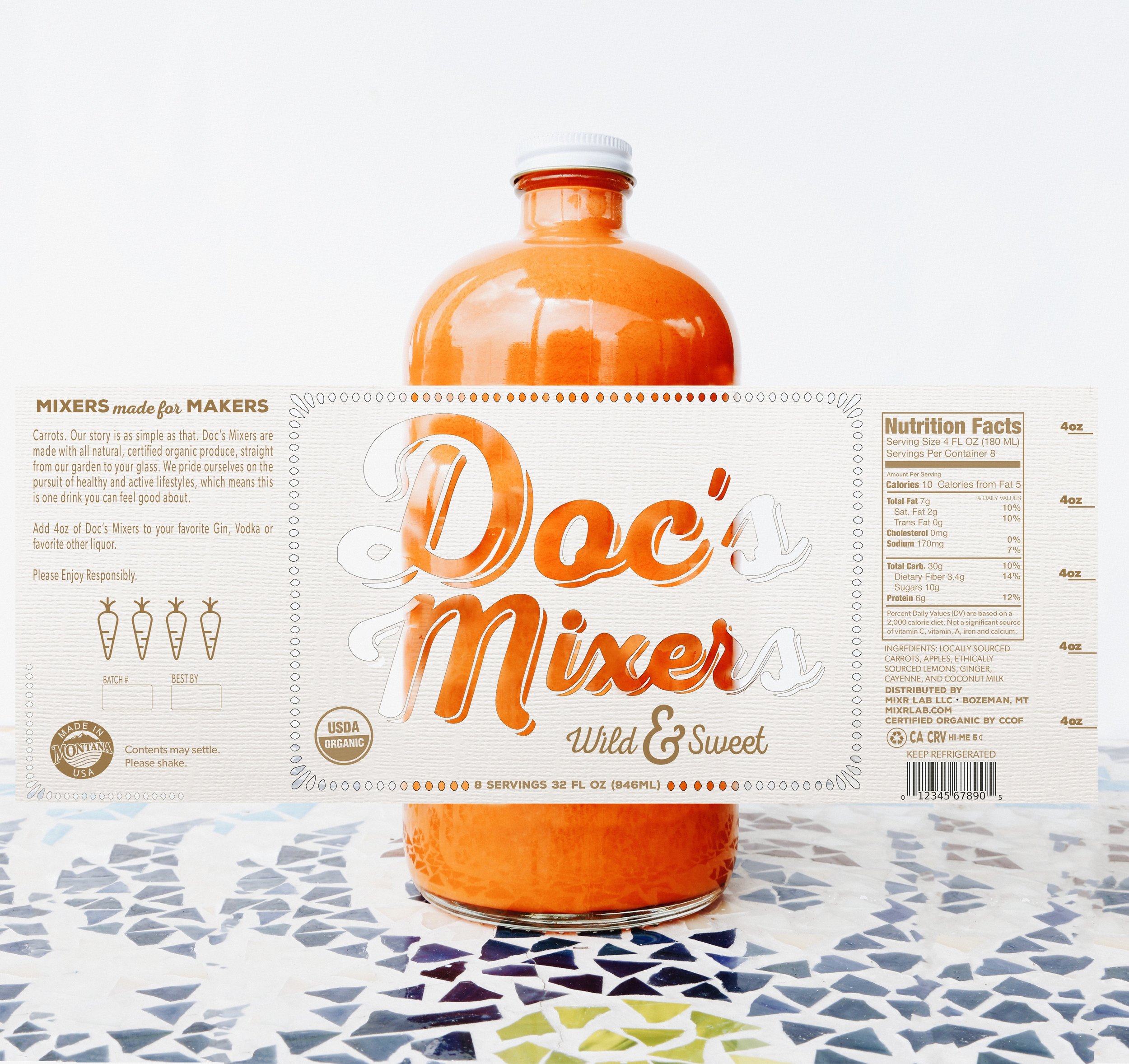
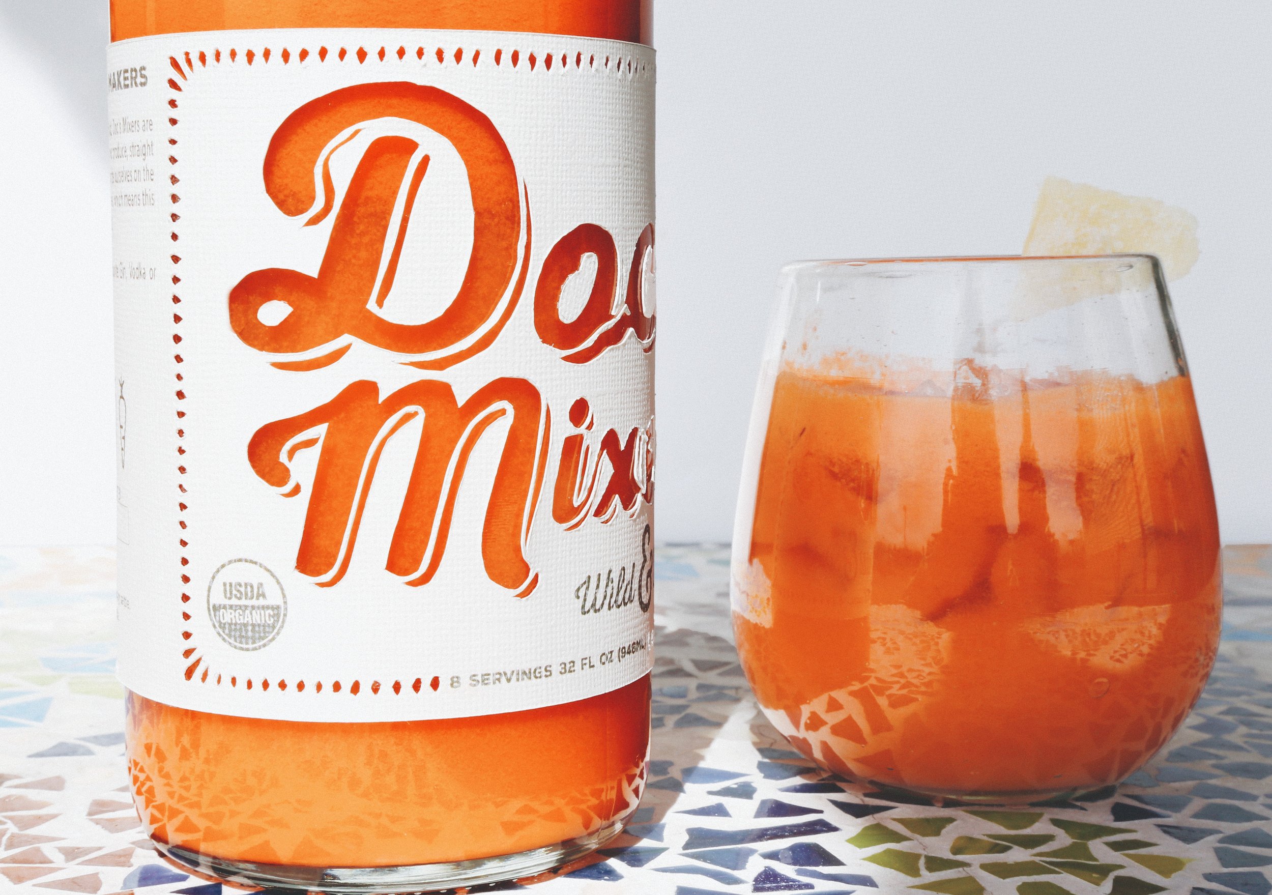
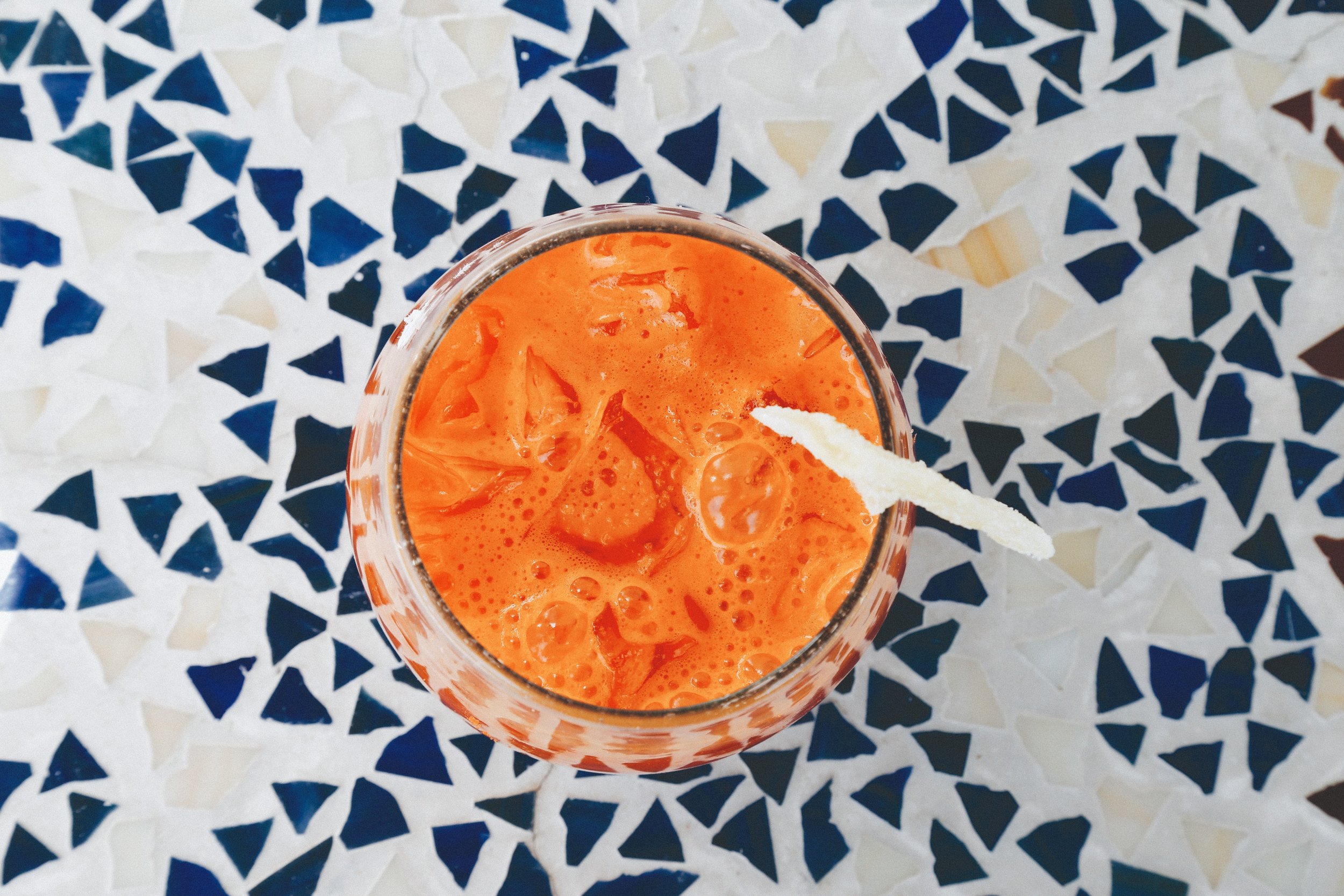
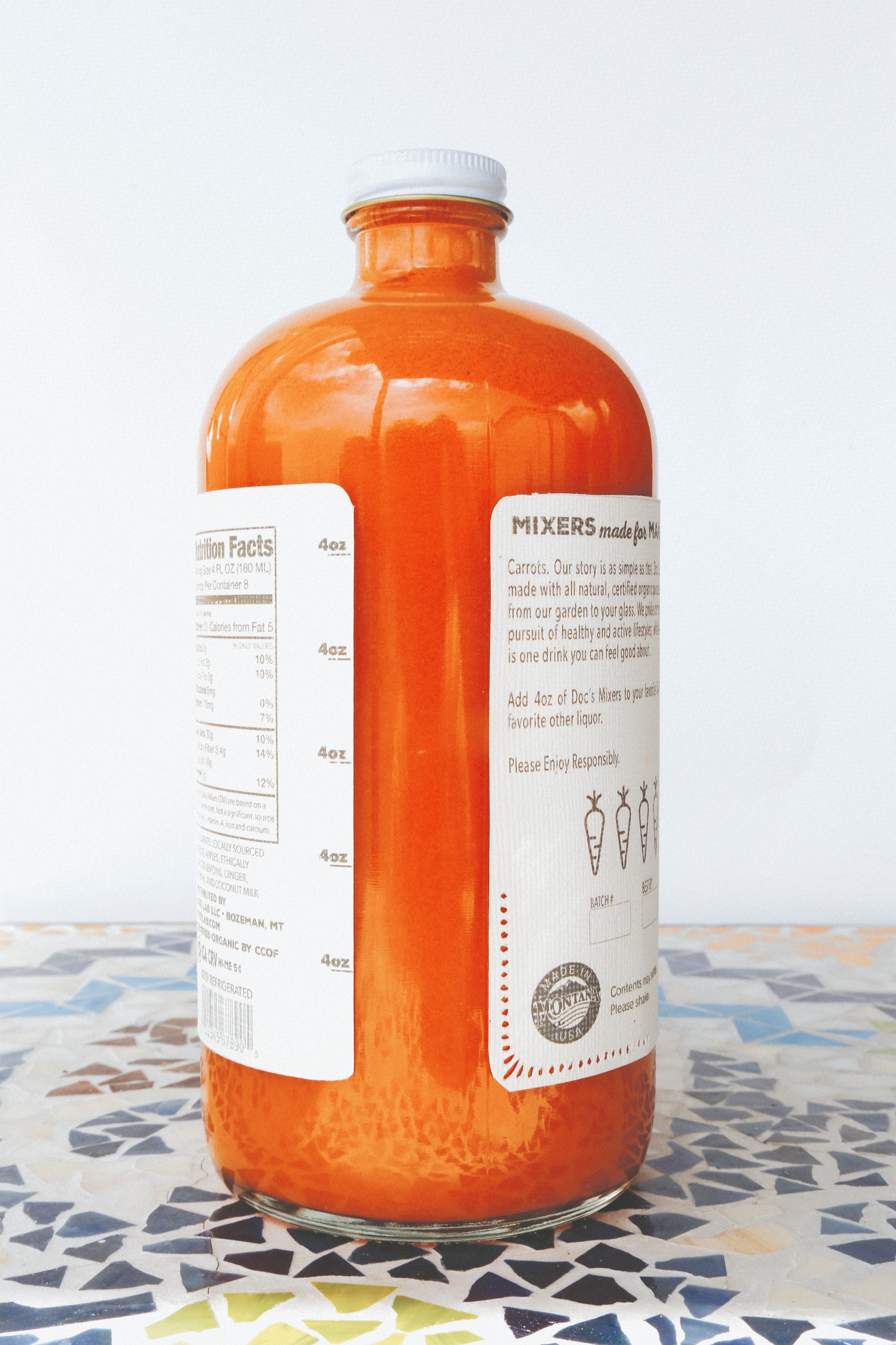
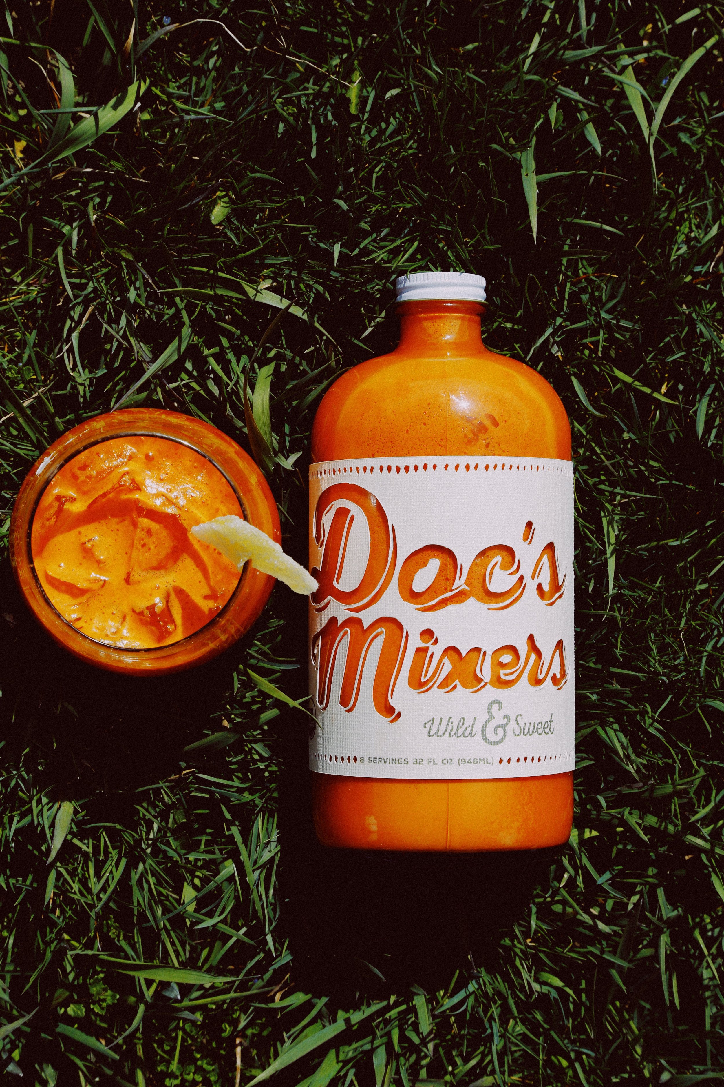
Doc’s Mixers | Branding
Creative Direction • Rapid Prototyping • Brand & Packaging Design
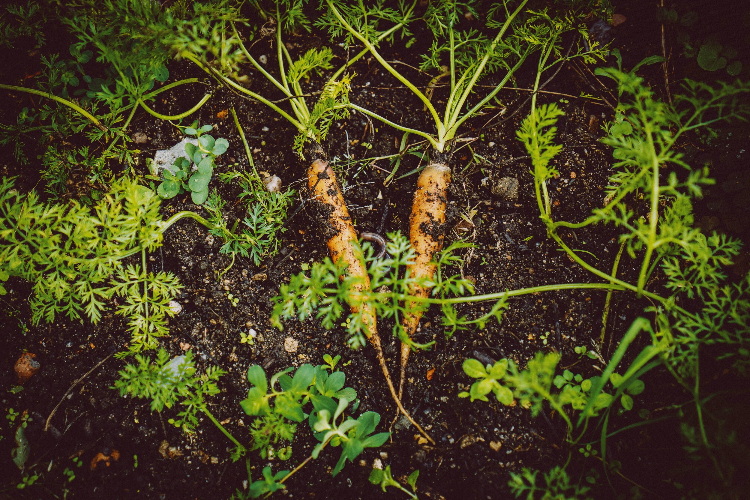
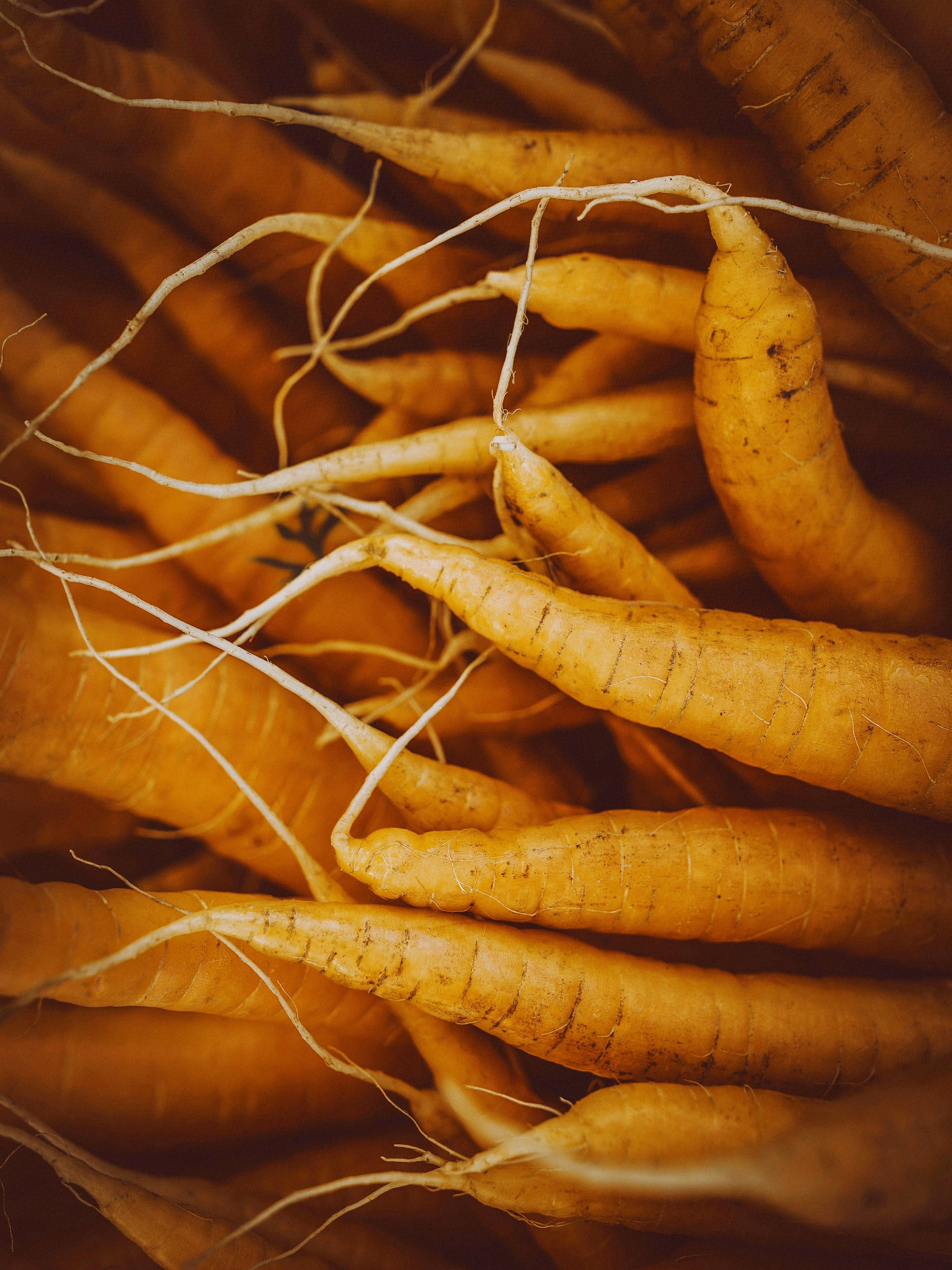
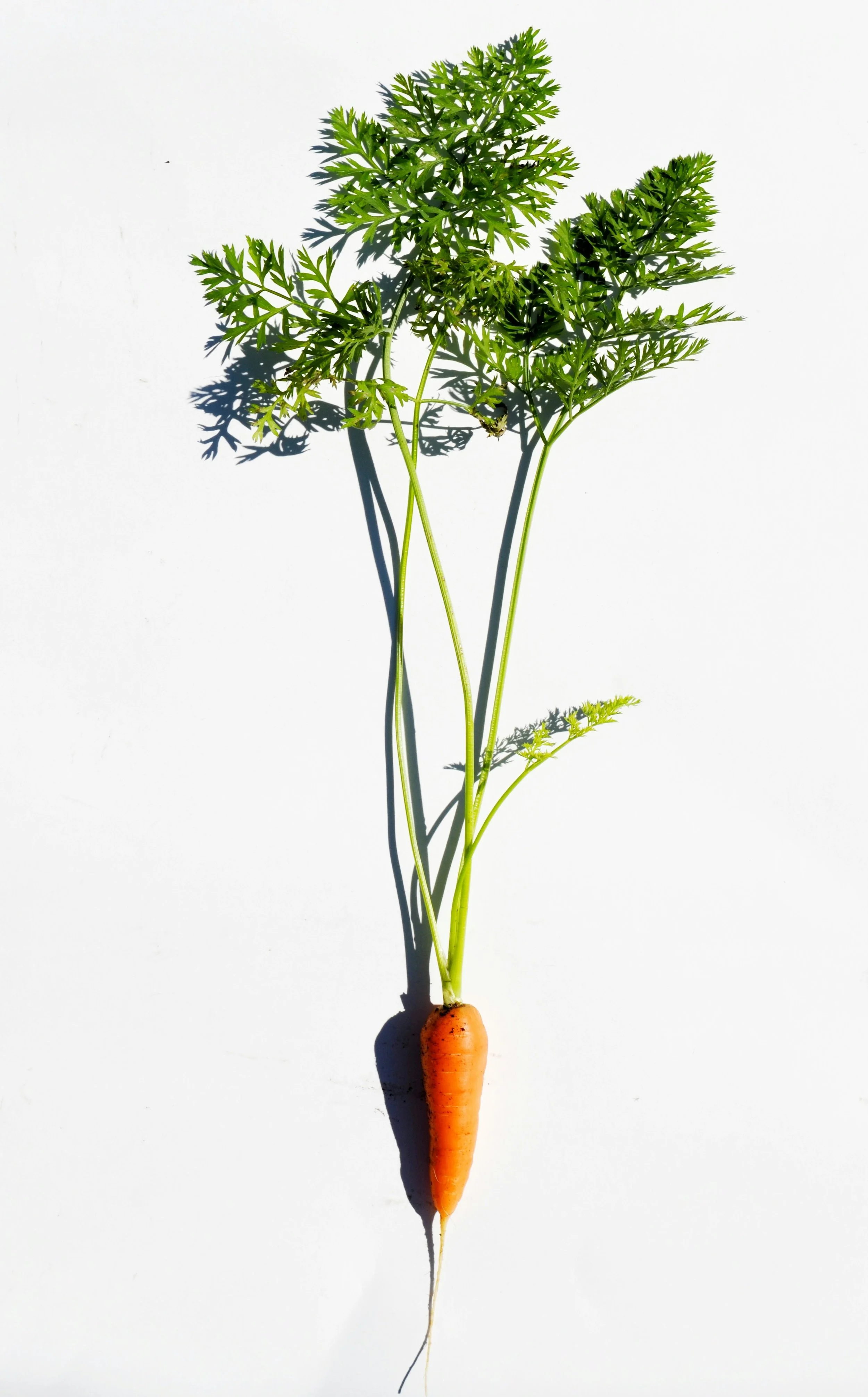
As part of Montana State University’s Farm to Market course—a multidisciplinary class developed through the Design Sandbox for Engaged Learning (DSEL)—our team of three (a graphic designer, a nutrition student, and a business marketing student) was tasked with addressing real-world challenges facing local producers. Our focus: the high waste generated during baby carrot processing, which discards approximately 45–50% of the original carrot.
In a fast-paced design sprint completed across two sessions, we developed Doc’s Mixers, a concept for a nutrient-rich juice mixer that repurposed carrot trim into a wellness-forward beverage. Inspired by apothecary aesthetics and rooted in holistic health principles, the brand took cues from the Latin origin of the word “carrot” (Daucus) and aligned with emerging trends in functional food and sustainability.
Though originally created as a student concept, the project later inspired a real-world product extension under the elixir line at Farmented Foods, where the focus on upcycling produce into functional beverages continues to thrive.


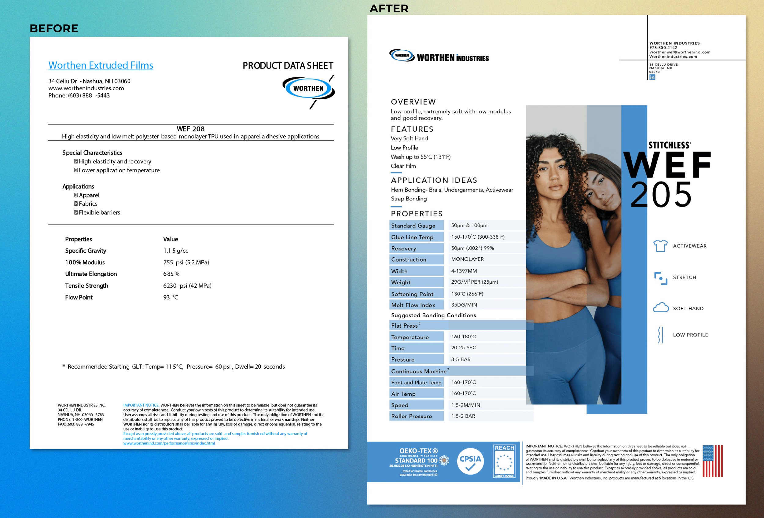
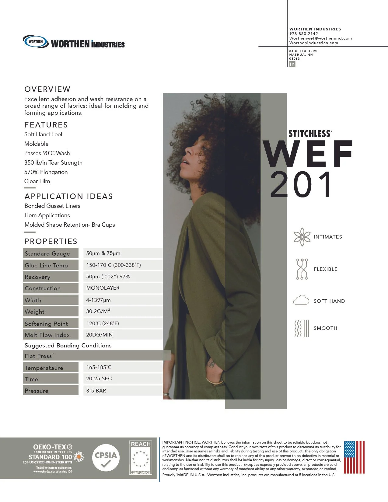
Worthen Industries | Print Collateral
Layout Design • Marketing Materials • Icon Design • Template Design
I was brought on to redesign a system of data sheets for Worthen Industries’ new line of adhesive tapes and films, developed for use in activewear and technical apparel for brands like Nike and Lululemon. The goal was to improve product clarity and visual appeal while making it easier for buyers to compare adhesives and understand recommended garment applications.
The final system included a refined color palette to distinguish adhesive categories, a custom icon set to highlight product features, and a flexible layout template that ensured consistency across future sheets. The result was a clean, modular template that elevated the technical information while supporting Worthen’s sales and marketing goals.